Background
For this project, we were tasked with picking a large, well-known brand that is in desperate need of a brand identity redesign. As someone who loves fashion and makeup, Ulta was an easy choice, and I was shocked at some of the things I found in my research.
Ulta is the number one, top-selling beauty brand in the US, and their target customer that usually shops there are women with a higher income. However, Ulta’s brand identity doesn’t match their mission or their target customer. I wanted to refresh Ulta’s brand identity in a way that matched their company values and customer base while maintaining the integrity of what exists currently.
The final design reflects their mission of being a warm, welcoming, and fun place to shop through its use of typography, graphic elements, and bright colors while portraying the image that Ulta is a high quality, top-selling brand.
Objective
Refresh Ulta Beauty's brand identity in a way that promotes an image that is upscale, high quality, refined and promotes Ulta’s values of being friendly and approachable.
Project Type
Graphic Design, Branding, Logo Design
Current Brand Identity
Creative Process
Skip to final projectStep 1
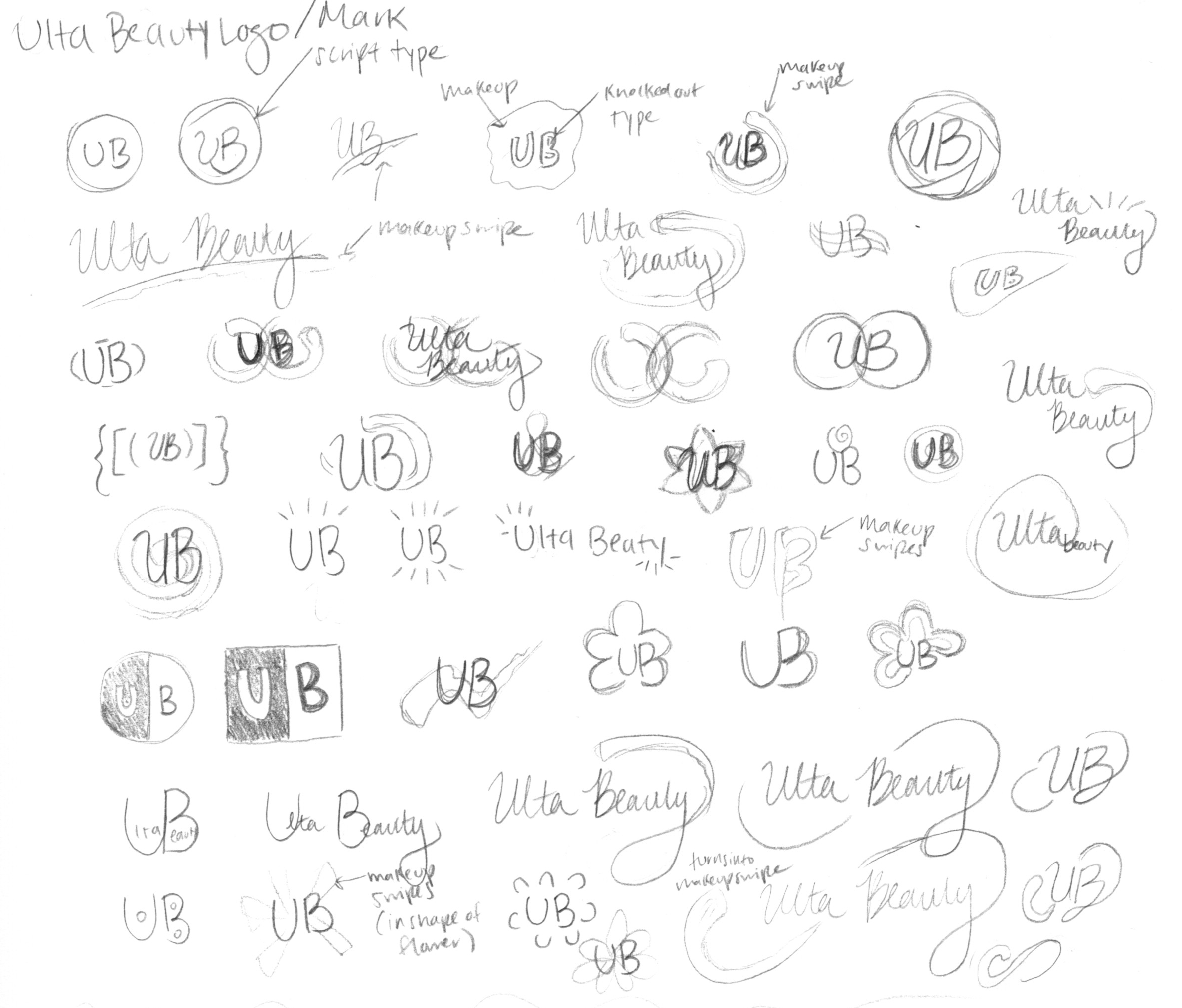
Logo/Mark Sketches
Step 2
Logo Digital Designs
Step 3
Initial Concepts
Step 1
Logo/Mark Sketches
Step 2
Step 3
Logo Digital Exploration
Initial Concepts
Logo/Mark Sketches


Initial Concepts
Exploring how to place the new logo
Final Project
Adobe Illustrator, Adobe Indesign, Adobe Photoshop
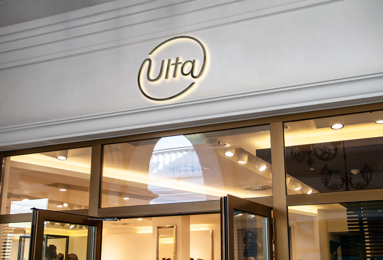
Final Logo & Colors
The updated logo is simple, sleek, and dynamic. The shape of the logo was inspired by the shape of a circular compact container and the “swoosh” in the original logo. The shape is more elliptical for a dynamic feel.
Ulta’s brand colors have been updated to maintain its warm, friendly, and fun appeal with an added touch of sophistication.


Primary colors

Secondary colors
Store Applications
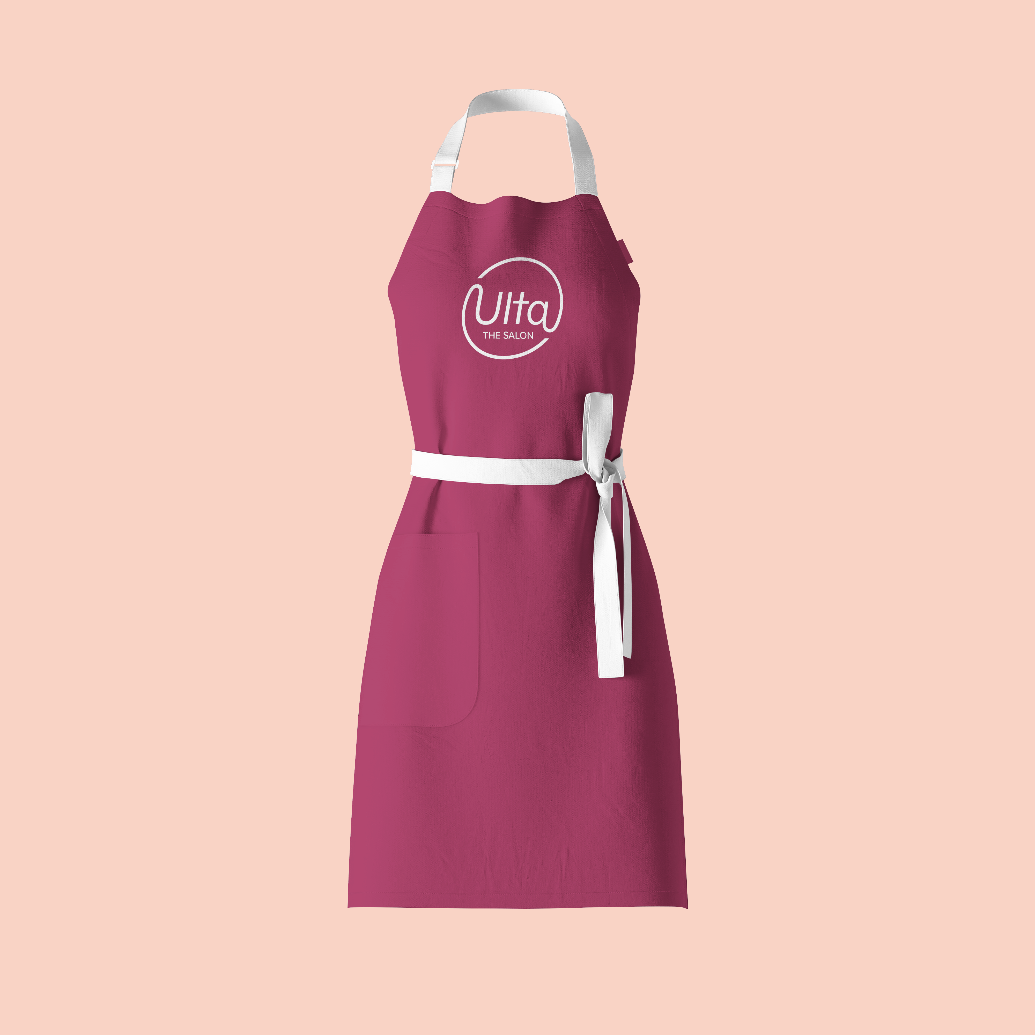
Employee Uniforms
Ulta employees previously lacked any singular identifiable uniform. The updated uniforms make the employees easily identifiable by utilizing brand colors for a smoother in-store customer experience.
Advertising
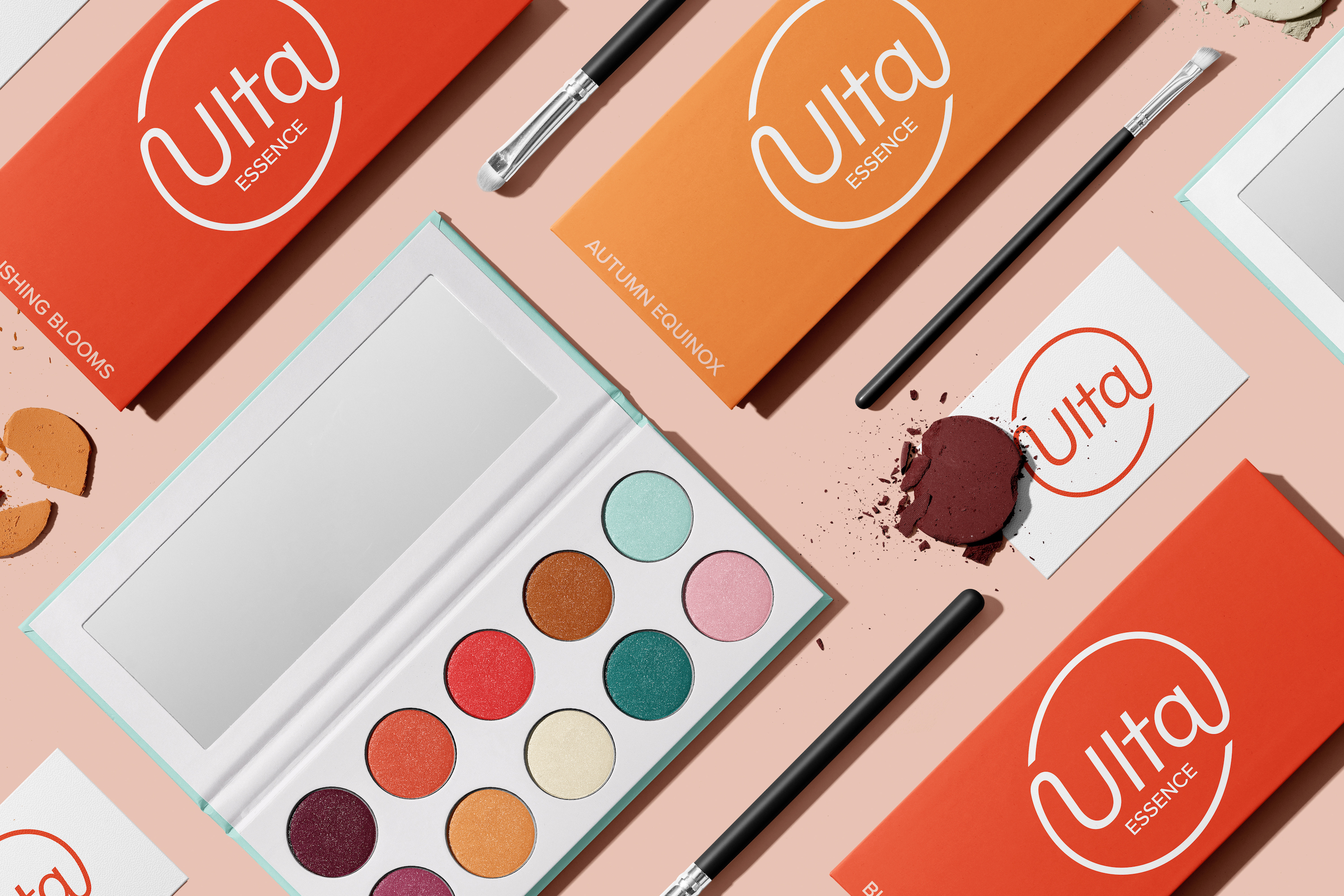
Products & Packaging
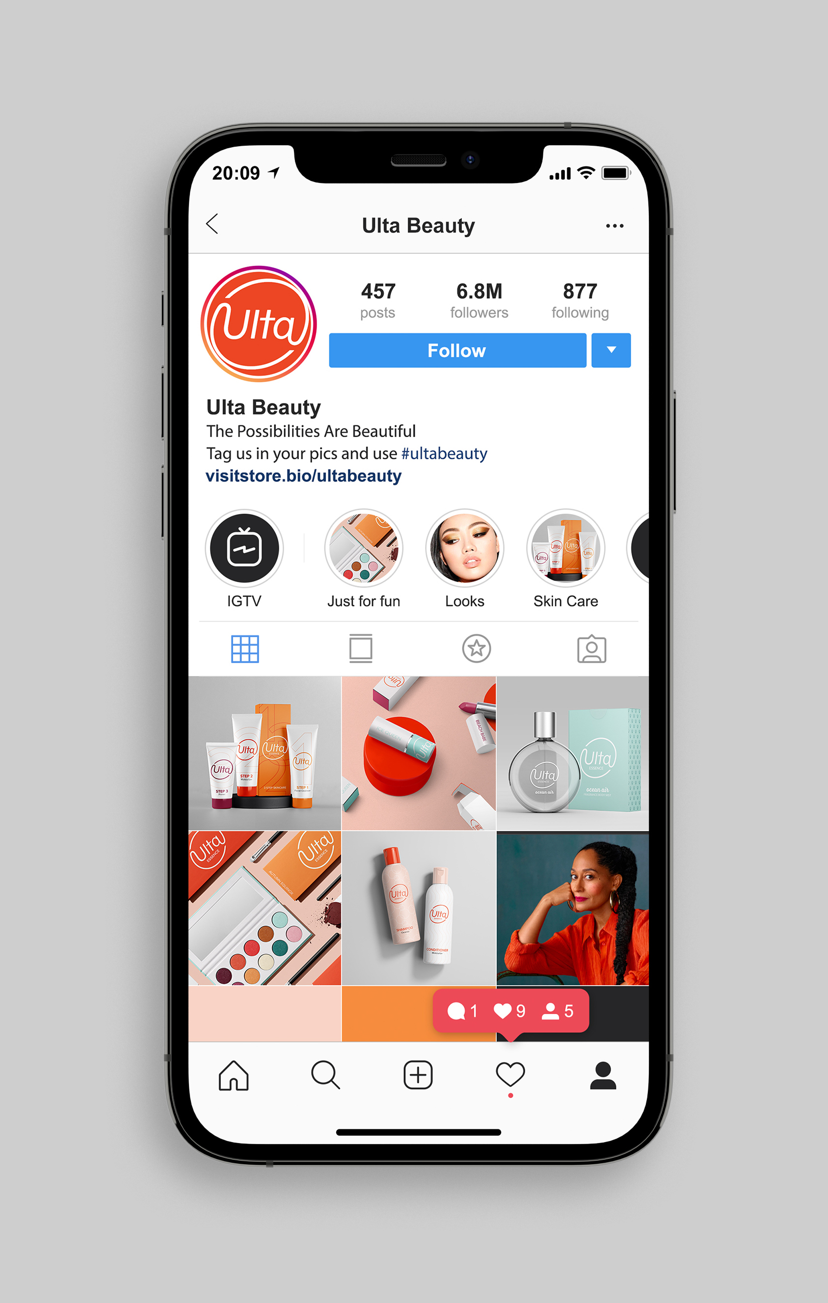
Social Media
Website & Mobile App
Website
The layout of the new website is clean and easy to navigate. On the homepage, there are featured products, Ulta’s person of the month, and what’s happening in the news so customers are aware of Ulta’s positive impact and latest advancements. Since shopping for makeup can be overwhelming, there’s also an option to chat with someone directly for help.
Mobile App
The mobile app makes shopping in-store and online a more seamless experience. Users have easy access to coupons, a barcode scanner, and an in-store navigation tool so they can more easily find the product they’re looking for.
Want a more in-depth look at the process?
View full length process bookWant to see a similar project?

Or something a little different?


