Background
SCADpro is SCAD’s internal innovation studio that gives students the ability to work in collaboration with real companies on real-world projects. BlackRock, the world’s largest asset management firm, came to SCAD with a challenge: digitizing and modernizing their institutional client business.
After collecting the research, speaking with BlackRock representatives, and developing concepts, we divided into teams to most efficiently and effectively execute the project. As part of the UX and graphic design teams, I worked with a large multidisciplinary group of fellow students and helped lead from research to concept to execution. For the final project, we developed a system that would ultimately better the flow of the way BlackRock conducts business by eliminating unnecessary steps in daily processes and make the experience seamless for representatives and consultants on both sides. Although mostly digital, we also didn’t want to forget the importance of human interaction.
Objective
Facilitate BlackRock in setting a new holistic industry standard by creating an optimized institutional client experience.
Project Role
Project Lead
UX & Graphic Design
Research
The first thing we did as a team was meet with the client so they could give us a brief overview of the challenges they were facing and the goals they wanted the project to accomplish. While meeting with them, I wrote down every problem I heard they had. After the meeting, they gave us a stack of documents and a brief walk-through of their currently existing portal. Again, I wrote down every issue I found, color coded them, and narrowed them down to six main issues that guided us through the rest of the project.
Pain Points
– It’s not easy to sort through or keep track of documents
– The experience isn’t as data rich as desired
– Sorting through portfolios is confusing
– The process is slow, difficult, and there isn’t enough transparency
– They wanted a more personalized experience
– There is a lack of human interaction
Creative Process
Skip to final projectStep 1
Project Timeline
Step 2
Step 3
Step 4
Set Project Goals & Deliverables
Whiteboard Sketches & Ideation (UX/UI)
Midterm Review & Refinements
Step 1
Project Timeline
Step 2
Set Project Goals & Deliverables
Step 3
Whiteboard Sketches & Ideation (UX/UI)
Step 4
Midterm Review & Refinements
Project Timeline

Project Goals & Deliverables
Determining scope and what the project needed to accomplish.

Whiteboard Sketches & Ideation (UX/UI)
Ideating how to solve for the pain points and how to bring our goals to life.

Midterm Review & Refinements
BlackRock’s currently existing portal, Gateway, lacked many of the necessary tools and resources representatives and consultants alike were asking for. As part of the UX team, we decided to implement the new portal in phases to make it more attainable and set a realistic timeline as to when the new concepts could be implemented.
The first phase was gateway2.0.
Phase 1 | gateway2.0
In our research, we found that consultants were jumping between tabs to gather all of the information they needed throughout the day. BlackRock’s own fund information wasn’t even available within their own portal. We created a new portal that would serve as a consultant’s one-stop-shop to eliminate unnecessary steps in their daily routine. gateway2.0 provides a more transparent, personalized, organized, and overall seamless experience.

Home screen with client snapshots, a to do list, and an integrated email inbox

Fund Information

Documents
Phase 2 | BlackRock One
As the second phase of the process, my team and I designed BlackRock One as the automated version of gateway2.0. Now, the to-do list, clients on the homepage, document organization, etc are all automated (based on factors like order of importance and urgency) to improve organization, transparency, and overall efficiency of daily processes and communication.

Home screen

Fund Information

Documents
Phase 3 | BlackRock Assist
Phase 3 was BlackRock Assist, an automated personal assistant tailored to internal teams and consultants to create the most transparent, efficient, and data-rich communication possible. BlackRock Assist serves as an important data hub and a way for consultants and representatives to gather information quickly and effectively throughout their busy day.
Welcome Box
Although we were heavily focusing on a new digital system, one pain point was that there wasn’t enough human interaction and a lack of information about the on-boarding process. BlackRock still wanted to keep a personal touch to the process and provide the transparency their clients were asking for. We ideated the on-boarding “Welcome Box” as a way to welcome new clients to the BlackRock family and inform them of the on-boarding process.
Midterm Presentation & Refinement
At the midterm presentation, we printed out the screens we’d designed, hung them around the room, and invited our BlackRock guests to provide feedback on sticky notes that we could save for reference later. The feedback was overwhelmingly positive with minor adjustments needed for functionality.

After the midterm presentation, we worked to get into the nitty gritty details of the system as a whole. My team continued to do whiteboard sketches and discover other ways we could expand the system, such as a mobile platform, since one didn’t previously exist. Each team worked together to hone in on creating a holistic experience for BlackRock and consultants through every component of the system.
Final Deliverables
For the final concepts, my team massively expanded the UX system to explore how the new portal would ideally exist. We expanded it to include different customizable layouts, a news tab, an automated calendar, an extended client view, predictive technology to indicate future fund performance, and how the portal might exist on a mobile platform so that consultants and BlackRock representatives are prepared for their day and are aware of urgent matters.
In the final prototype my team and I had created, we wanted to integrate BlackRock Assist into the BlackRock One portal and mobile application to create a truly holistic system. BlackRock Assist exists both in and outside the portal to serve as an assistant both at and away from the desktop to guide the consultant or BlackRock representative seamlessly throughout their day, wherever they are.
Brag Points

Personalization

Communication

Automation

Transparency

Consolidated Data

Relevant Info
Becky & Greg
Through an animated video created by our animation team, we wanted to tell the story of Becky, an internal BlackRock relationship manager, and her relationship with Greg, an external consultant. How could we help them both feel validated and remove the daily stresses of their relationship?
BlackRock One

Home Page
Personalization, Communication, Automation, Transparency, Consolidated Data, & Relevant Info
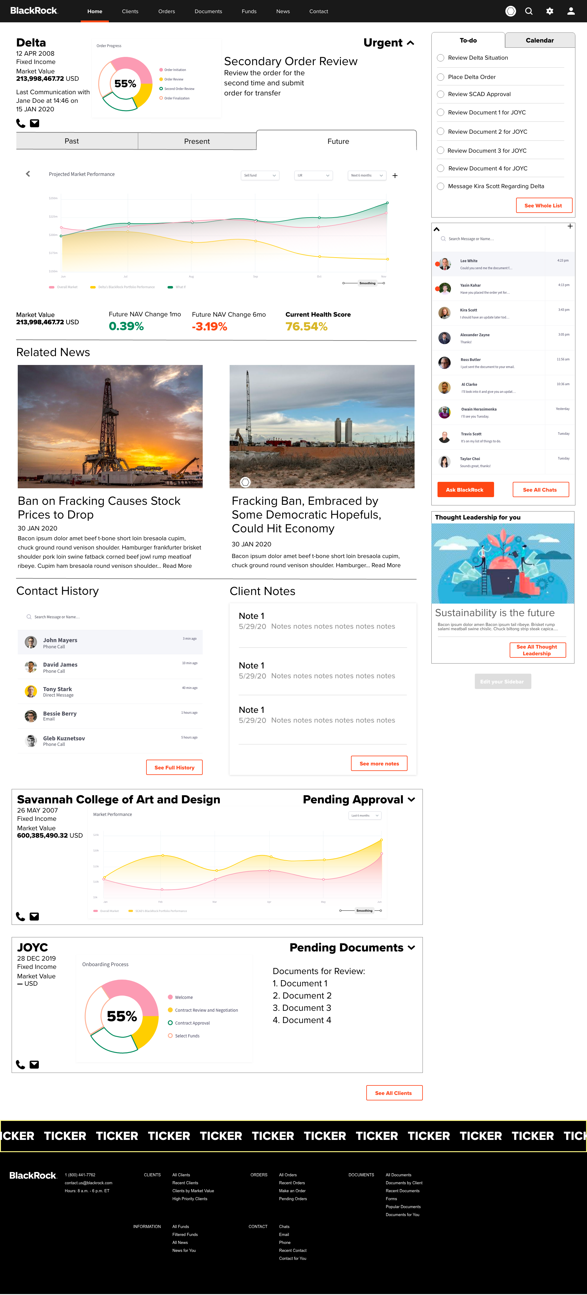
The home page is automatically sorted based on what the consultant or representative has to get done that day. Client snapshots show a preview of where the client is in the on-boarding process and how their portfolios are performing. Consultants and representatives can customize the layout of their home page and communicate with colleagues without exiting the portal.

Default view

Grid view

List view
Calendar - Detail
Home - Extended View & "What if" Tab
Automation & Relevant Info
The client extended view shows a more in-depth look at the client's portfolio and related information that could affect its performance.

Past Performance

Present Performance

Predicted Performance
Documents
Automation & Communication
Documents are automatically organized and can be sent to the relevant people internally to increase the efficiency of daily processes and communications.

Documents

Share Document
Orders & Funds
Relevant Info & Consolidated Data

Orders

Funds
News
Relevant Info & Consolidated Data
Something we heard was that consultants want relevant market insights and their effect on related funds. To further drive home the concept of the new portal being their one-stop-shop, we added a news tab so they could get relevant information all in one place.

Breaking News

Relevant News
Mobile App
Home, News, To-Do List, & Calendar
Previously, the portal wasn't available on a mobile platform, and BlackRock representatives and consultants had no quick way to respond to an emergency. We wanted to change that.

BlackRock Assist
Final Prototype

Welcome Box
The final welcome box would be personalized for the client to give it a more personal touch. The final contents include a notebook, a pen, a flash drive with any additional information the client may need, and a slip of paper with information about the on-boarding process.
Want a more in-depth look at the process?
View full length process bookWant to see a similar project?

Or something a little different?


