Background
SCADpro is SCAD’s internal innovation studio that gives students the ability to work in collaboration with real companies on real-world projects. MARTA Artbound, a division of Atlanta’s public transportation system dedicated to beautifying MARTA, came to SCAD with a request: designing new interactive bus shelters for their riders.
After speaking with MARTA’s riders, speaking with MARTA representatives, and developing concepts, we divided into teams to most efficiently and effectively execute our vision. As part of the UX and graphic design teams, I worked with a large multidisciplinary group of fellow students from research to concept to execution to develop the most holistic solution possible for MARTA and its riders. Over the course of the project, the scope grew to include bus shelters and digital interfaces that would help MARTA’s riders and employees feel more comfortable and validated in their daily routines. After speaking with MARTA’s employees and riders alike, we were motivated by their daily troubles to develop something purely human-centered.
Objective
Develop holistic solutions for MARTA and its riders to create an experience that is comfortable, community-driven, and accessible.
Project Role
UX & Graphic Design
The Ask

Move the Artbound initiative beyond the scope of the MARTA rail stations
Provide useful amenities for the under-served and bus dependent communities
A design that is both scalable and customizable
Serve all of MARTA communities equally
Fill the gap where other areas of MARTA is not
Research
After speaking with MARTA Artbound representatives, we paired up to ride the buses and trains to immerse ourselves in what it was like to be a daily rider. My partner and I traveled from SCAD Atlanta to Perimeter Mall, and set the goal to be there and back within two hours. We were only one of two groups to actually meet our goal. During our two hour ride, we spoke with other riders and asked them questions about their daily experiences riding MARTA. What made them comfortable? Uncomfortable? What were their frustrations? What could be done to make it better?
Current State
After riding the buses and trains around many parts of Atlanta, we each collected a number of images depicting the current state of MARTA and its facilities. The maps and navigation tools provided were confusing and unhelpful, some maps were missing altogether, a lot of the technology (like the gates) didn't work, signage to get in and out of the stations was confusing, and we found a good amount of broken glass and damaged property.
Key Observations
1. Navigation was highly difficult and confusing
2. There were some safety issues and many riders were generally uncomfortable
3. The system is inefficient and people want to know when their bus/train will be there
Creative Process
Skip to final projectStep 1
Affinitization
Step 2
Step 3
Step 4
Ideation & Critique
Digital Interface User Flow
Midterm Concepts
Step 1
Affinitization
Step 2
Ideation & Critique
Step 3
Digital Interface User Flow
Step 4
Midterm Concepts
Affinitization
Two of the biggest complaints we heard while talking with riders was how confusing it was to navigate, and the inefficiency of the system and buses sitting in traffic. People didn’t want to play the guessing game as to when their bus or train would be here and whether or not they would be on time. While we couldn’t make Atlanta traffic disappear, we saw opportunities to make their experience with MARTA more comfortable.

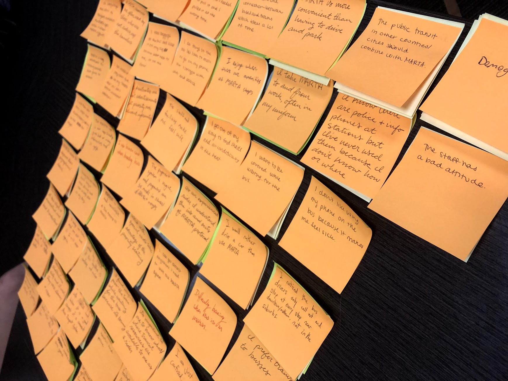
We covered the wall in sticky notes with everything we noticed and heard from the riders and narrowed it down to a few key insights that guided us through our concepts to create the best experience possible for MARTA’s riders.
Key Insights

Both personal and systematic changes are needed for MARTA to attract more riders and satisfy current riders

My MARTA trip is affected by the periods and variables that happen before and after

My time and wellbeing are important to me and MARTA’s services need to reflect that

The facilities and services provided by MARTA are underwhelming

MARTA has the opportunity to emphasize community and be more than a transit system

Navigating the transit system is confusing and the information provided by MARTA is lacking and unhelpful
Ideation & Critique
After developing our key insights, we began to ideate what these new shelters could look like and the amenities they might have.

Digital Interface User Flow
After speaking with MARTA’s riders and hearing their pains, we determined that simply redesigning their bus shelters wasn’t enough. We wanted to pitch a digital, interactive kiosk to help their riders navigate the system. After initially assisting in the development of concepts for new interactive bus shelters, I was part of the UX and graphic design team that developed the Digital Interface to help riders feel more comfortable navigating the system.
In addition to the kiosk, my team also agreed that an updated website and rider app was necessary to make riders’ experiences more enjoyable. While I was helping with the interface, my teammates got to work on the new app and website.

Midterm Concepts
For our midterm concepts, the team pitched their ideas for new bus shelters and how it would help improve the experience of their riders. The UX team pitched our digital interface as a part of the shelters and as an integral part of a rider’s trip. After finding that 80% of MARTA riders did in fact own a smart phone, we also introduced our initial concepts for a responsive website and app that riders could use on the go.
Digital Interfaces
Shelter Kiosk
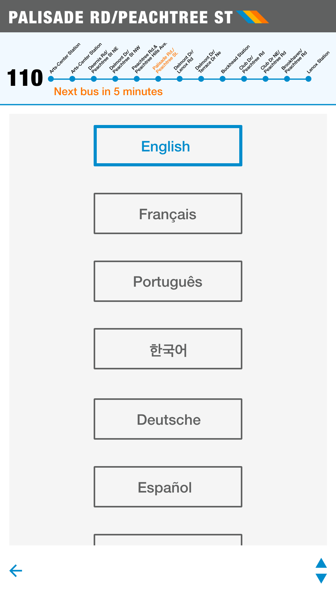
Although it was not part of what MARTA had originally asked for, we thought it was important to advocate for the needs and wants of their riders. We couldn’t make Atlanta traffic disappear, but we could tell riders how far away their bus is, what there is nearby to do in the meantime, and allow them to plan their trip to find the most efficient way to get to their destination. We also included the ability to change the language of the kiosk to be more inclusive for all riders.
Mobile App & Responsive Site
The previously existing website wasn’t responsive, and neither the website nor the app provided the resources or tools MARTA’s riders needed to plan and get through their trip. The newly designed app and website provided necessary updates, navigation tools, and a way to reload your Breeze Card.
Website - Mobile

Website - Tablet

Website - Desktop

Bus Shelters
We wanted the bus shelters to be something special to the communities that they were in. Each shelter had different levels of customizability and could be decorated by local artists to make it truly special to the community.
The Southern Stage
After noticing that many riders struggled to find comfort when riding MARTA, we developed the porch idea as a traditional place of community gathering. The concept was warm, friendly, and inviting, and would serve as a local landmark in its community.
The Connector
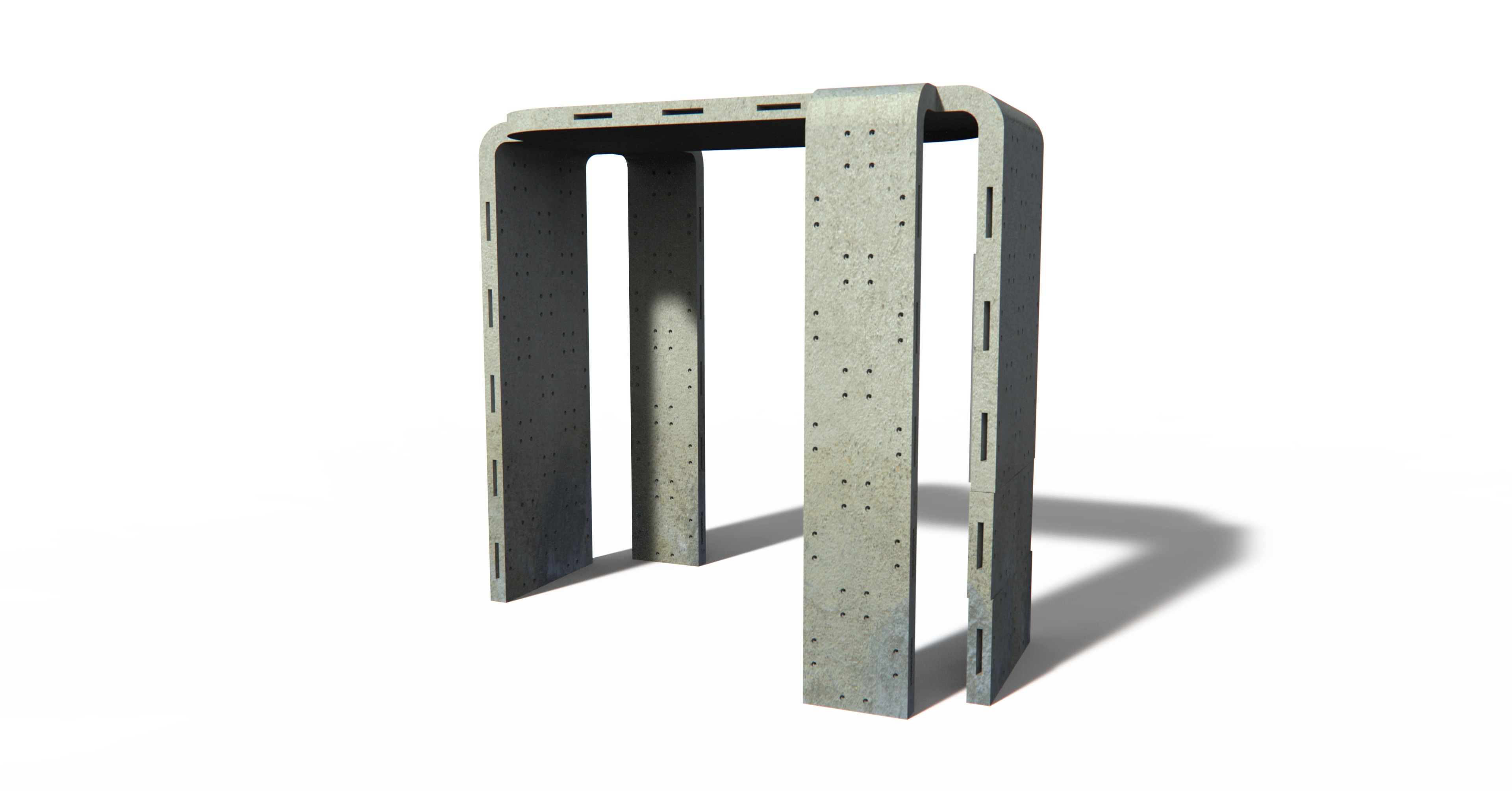
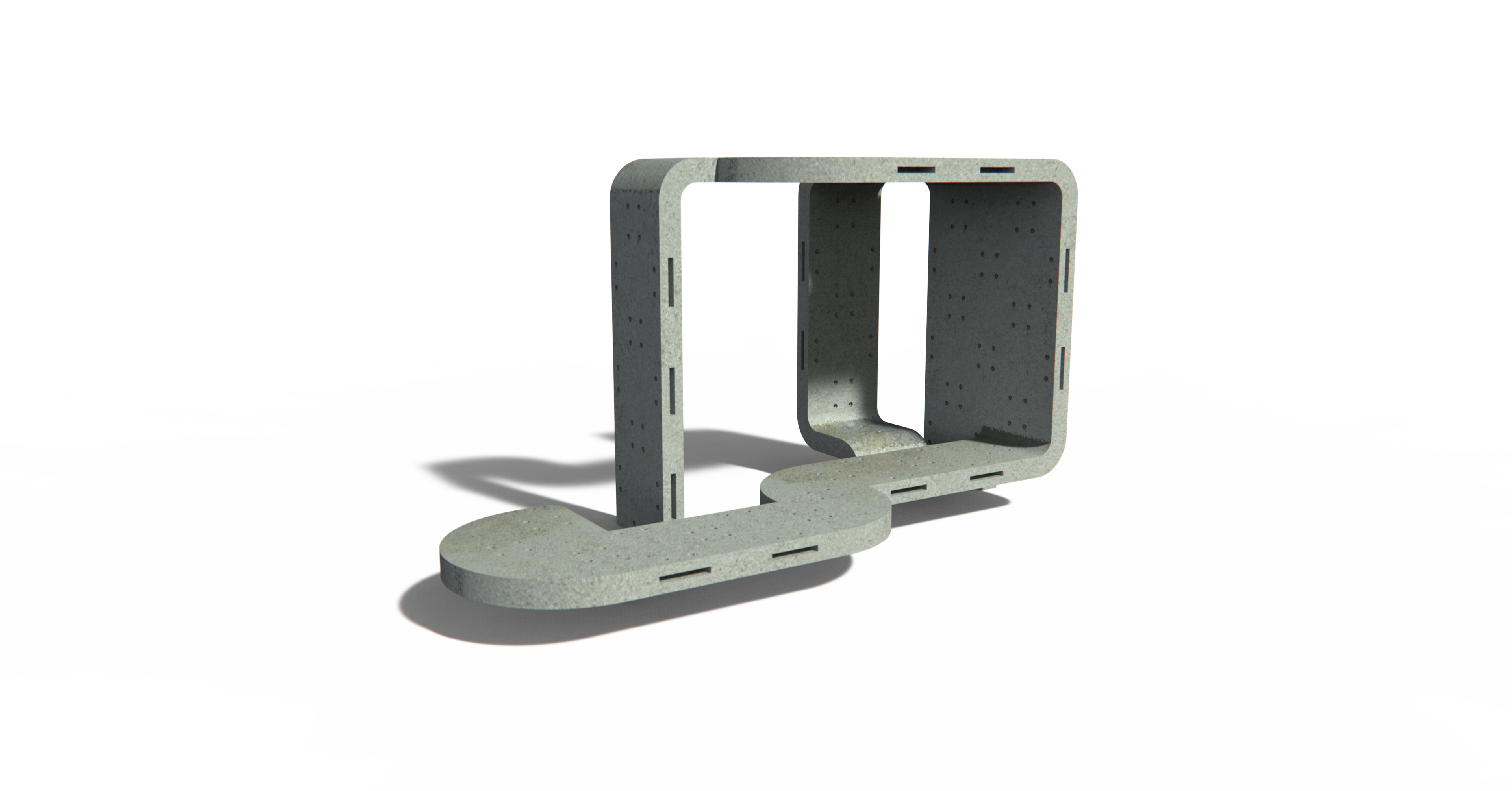
Bus shelters aren’t exactly a “one size fits all.” Different communities have different needs, so the industrial design team ideated The Connector as a way for communities to fully custom design a shelter suited specifically for them and could be infinitely expandable.
Canvas Car
The idea behind the canvas car is that it could not only be a canvas for a local artist, but completely made of recyclable materials as well. Using an old cargo container and turning it into a bus shelter would be both cost effective and better for the environment.
The SightSeer
Bus shelters are expensive to produce and maintain, and not every community has the means to do so. The Sightseer was an easy, sturdy, more cost effective bus shelter design for the communities that wanted a shelter without the stress of cost or maintenance.
Refinement
After the team presented our midterm concepts, we narrowed down the concepts and made refinements based on what we wanted them to accomplish for MARTA’s employees and riders based on The Ask. My team refined the kiosk to be more realistic with better usability based on usability testing and expanded the rider app and made it a direct continuation of the kiosk experience. The industrial team narrowed down our shelter concepts and made general refinements on the designs.

Final Project

Shelter Navigation Kiosk
Kiosk Screensaver
One complaint that we heard from MARTA’s representatives was about the excessive use of intrusive ads, many of which were for injury attorneys. Of course, we couldn’t scrap advertising altogether. Instead, my team decided to add a screensaver to the navigation kiosk and show advertising for MARTA (and MARTA Artbound) to promote their services and latest updates, and to serve as a place for local community advertising.
Each of the restaurants or shops advertised were hyper-local to the area, making MARTA an advocate for its local communities and businesses. The screen features a quick “get directions” button to give the rider something to do while they wait for their bus.
Rider App
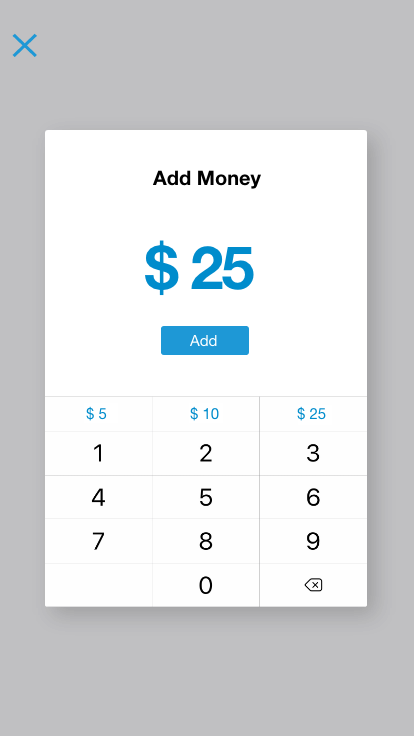
The Rider App provides a continuation of the kiosk and gives a more personalized experience. The app helps its user plan their trip and reminds them when to leave and when their bus or train is arriving. The app provides a quick, easy way to reload your Breeze Card and add a custom design.
Bus Shelters
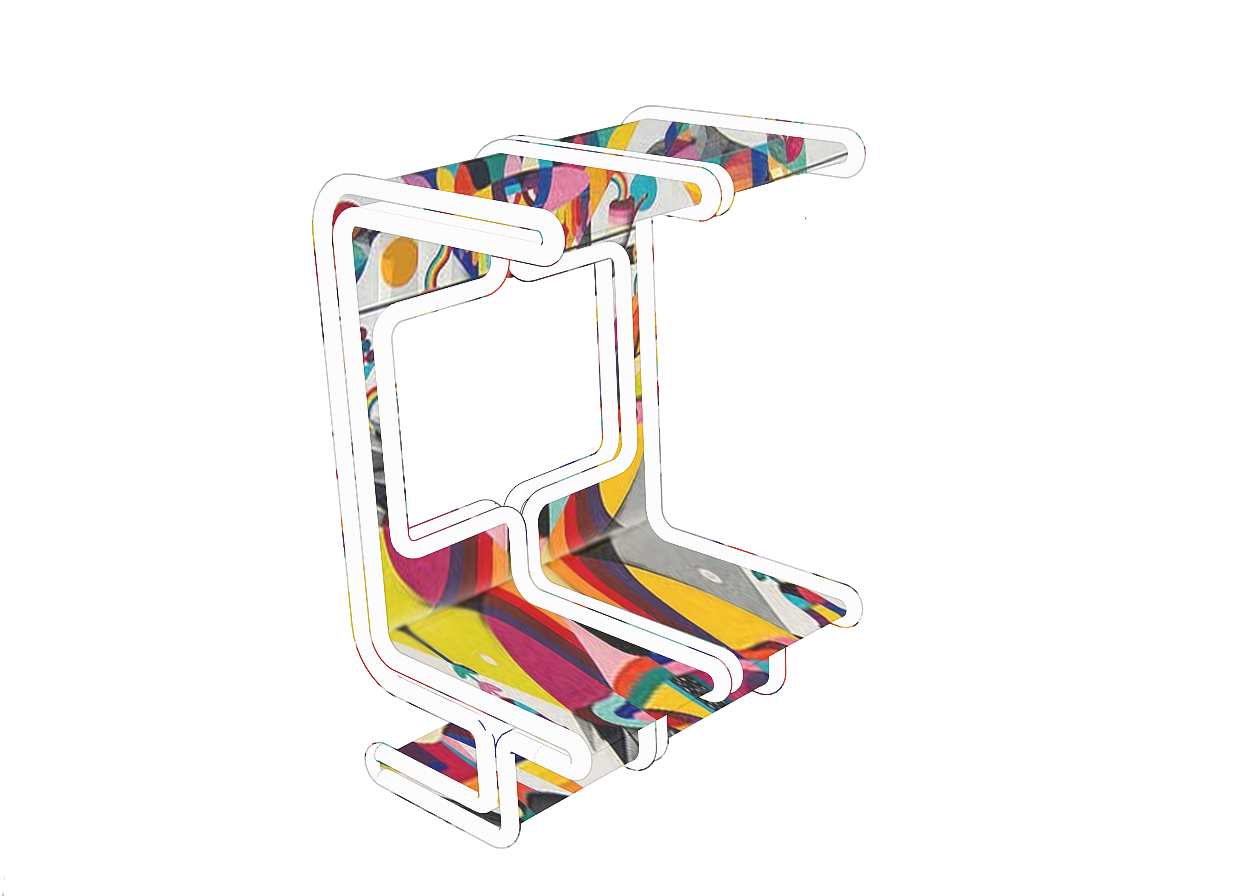
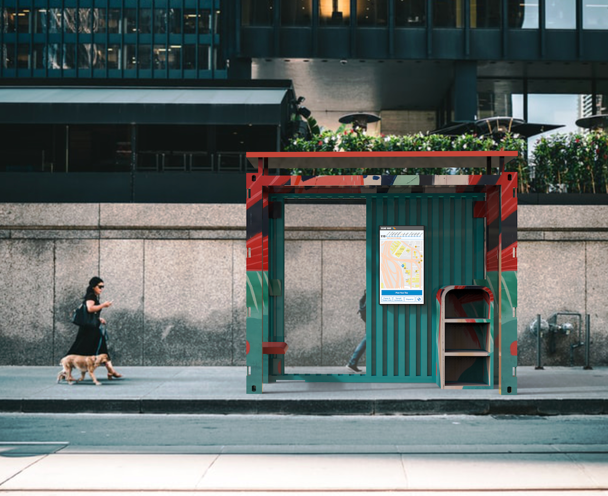
For the final concepts, the team measured our ideas against The Ask to determine how well each concept met the original goals. The team ultimately narrowed it down to three shelters by combining the Southern Stage and Canvas Car. We ended with three distinct concepts that each provided a different style and level of customizability to fit into its community seamlessly.
The Connector
Customizable, modular, and community driven.
The Canvas Car
Sustainable, customizable, and a celebration of Atlanta's history as Terminus.
The Plopper
Customizable, modular, and accessible and affordable for all communities.
Shelter Purchasing Site
While our focus was originally supposed to be set on MARTA’s riders, we couldn’t ignore the struggles we heard from MARTA’s representatives. One of the representatives that met with us was in charge of the bus shelters, getting them to communities, and filtering through the complaints and problems of those communities. We saw an opportunity to make his job easier and provide the operational transparency these communities were asking for.
After initially assisting in the concept development, the website was executed by one of my teammates and served as a place for communities to find a shelter perfect for them. We wanted the site to take a proactive approach to reduce the number of questions and complaints our MARTA rep was receiving, so we included a sort of “tracking” service that allowed communities to track the process of having their shelter installed.
Want a more in-depth look at the process?
View full length process bookWant to see a similar project?

Or something a little different?


