Background
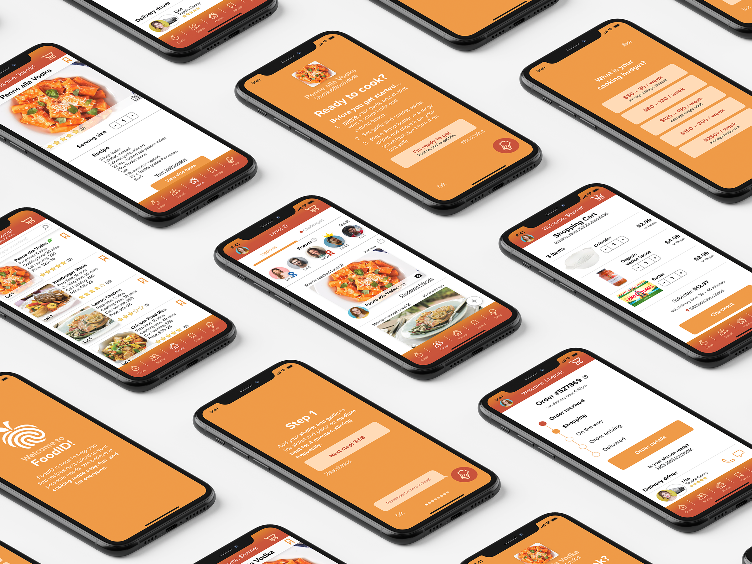
FoodID was created as a way to make cooking, and learning how to cook, easy and fun. The cooking apps that currently exist lack the necessary tools to teach its user how to cook and instead appear to act as a simple way to locate recipes. However, it still doesn’t solve the challenge of finding recipes that suits its user’s wants and needs. What if you’re not cooking for a family of four, just yourself? Or what if you don’t have a lot of time or you’re on a budget? There’s no current solution on the market.
To solve these issues, the final FoodID prototype features a design that is friendly, inviting, and intuitive to use. With features like personalized recipe recommendations, shopping within the app, recipes broken down into simple steps, live help, the ability to challenge friends, and way to keep up with your favorite recipes, FoodID makes cooking simple and stress-free. FoodID helps its user progress from beginner to expert by providing recipes that fit their current skill level and breaking it down simply. To keep the user motivated, FoodID turns cooking into a game that allows you to compete with friends and challenge them for the crown.
Objective
Create an app that solves the needs of Sherrie, a 19 year old college student, who is struggling to develop her cooking skills while still keeping the needs of other potential user types in mind.
Project Type
User Experience, Branding, App Design
Creative Process
Skip to final projectStep 1
User Journey/Story
Step 2
Step 3
Step 4
User Flows
Initial Sketches
Usability Tests
Step 1
User Journey/Story
Step 2
User Flows
Step 3
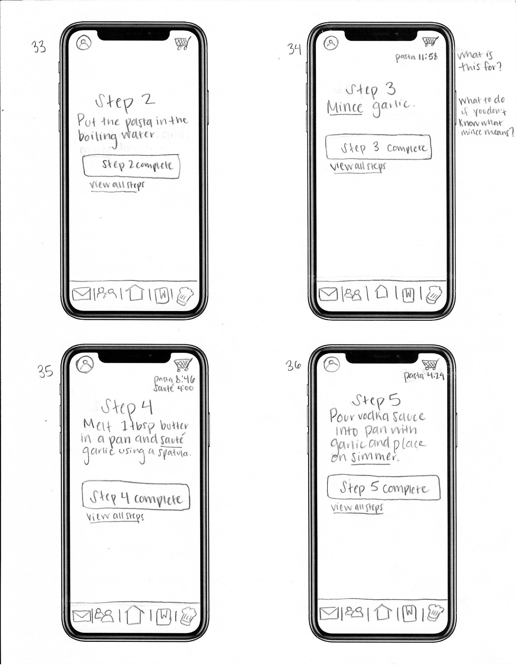
Initial Sketches
Step 4
Usability Tests
User Journey/Story
Who is the user? What are their struggles?
Sherrie just started her first year of college and is newly independent of her parents, who live hundreds of miles away. She now lives in her own apartment, and unfortunately, she never really learned how to cook. She doesn’t want to be stuck eating frozen meals, and she can’t afford to eat out all the time since she’s on a tight budget, but she doesn’t know where might be a good place to start developing her cooking skills.
Sherrie researches some basic recipes online and decides she’ll start off by trying to make a simple pasta dish. She writes down the list of ingredients she’ll need and goes to the store to pick up everything but is overwhelmed by the number of brand options for pasta and sauce and doesn’t know what to buy. “Is one really better than the other?” She pulls out her phone and looks up a few of her options to get an idea of which is rated higher, but she eventually shrugs her shoulders and picks something out. She gets all of the ingredients she needs and heads back home.
Sherrie starts setting everything out and then realizes that she’s not sure she has all of the utensils necessary to make the pasta. She has a few pans and some wooden spoons, but she didn’t realize she has no colander. She huffs and runs back out to the store to see what her options are. While there, she starts to look around and wonder what else would be good to buy as a beginner. “There’s so many things here. I don’t even know what half of them are.” Since it’s already getting late, she decides to just pick up a colander and do research on what else she’ll need later.
She gets home and starts to boil the water and dumps the pasta into a pot. “But wait, at what point should I start making the sauce?” I don’t want it to be cold but I also don’t want to wait too long. She shrugs and decides to go ahead and make the sauce and dumps everything into a pan. She chops up the garlic and goes to add a pinch of basil when the cap falls off. “Oh my god. I just ruined the sauce. I don’t know how to fix this.” The timer goes off for the pasta, and she turns the burner off and goes to drain the water. She dumps the pasta in the colander back into the pot and sets it on the counter, and she realizes the sauce is starting to burn. “How do you burn sauce? I must have started it too soon.” She turns the burner off and dumps the sauce into the pot with the pasta.
She looks into the pot and is flabbergasted at the amount of pasta she made. “Why does it seem like every recipe is for at least four people?” She sits down to eat it and can definitely taste the basil, but she guesses it could be worse. “I think it turned out alright, but where do I progress from here? I don’t want to try something too hard, and I don’t want to lose motivation.”
Pain Points
– Doesn’t know where to start and unsure how to progress
– Tight budgetUnsure about brand options
– Not sure what utensils to use
– “Every meal seems like it’s for at least four people”
– Not sure how to time the steps
– Doesn’t have the knowledge to fix mistakes
– Afraid of losing motivation/hard to keep motivation
User Flows
How can those pain points be solved?
Usability Tests (Observations & Conclusions)
Does the app make sense to other people? Is it intuitive?
Observations
Overall, the users tested seemed to understand and appreciate the purpose and differentiators of FoodID.They liked that it was personalized, and many of the users seemed inclined to utilize the social aspect of the app. Although the only clickable option on the finishing “Level Up!” screen (no. 50) was “maybe later,” many went to say “yes.” I also noticed that some of the users were surprised by the delivery feature of the app when they reached the checkout screen. Generally speaking, there was mass confusion and a mixture of answers as to what the icons were in the navigation/tool bar. The biggest points of confusion were around the envelope as in-app notifications and the chef hat as chef help. The best understood icon was the home button, followed by the recipe book.
Conclusions
Given some of the overall observations and consistencies, it will be important to find new icons that are more recognizable to users or find a way to present them beforehand (ie a joyride) so that the user understands what their purpose is. In general, revisiting the flow to make sure some smaller details are in the right place, such as asking for location permissions, will likely help foster a better understanding of the app’s features. Given that many of the users seemed very inclined to share their accomplishments, it may be a good idea to further explore and emphasize the social aspect of the app. Getting small details in order will be critical in polishing the final flows and designs (this means no more surprises about delivery). As I progress during the next design stages, additional user testing will be necessary to make sure the changes made make sense and are intuitive to the user.
Important Consistencies/Observations
– Users prefer to answer the questionnaires step by step
– The chef hat isn’t understood as a help button
– The envelope is not understood as in-app notifications
– Generally, there is a lot of confusion surrounding the navigation icons.
– There is lots of confusion on the plus sign. Most users see it as “more information” instead of “add to cart”
– Most users wanted to share their accomplishments with friends
– Some of the language used in the app should be more friendly, humorous, and playful
– More illustrations, pictures, or icons would make the app playful and be of better assistance in some instances
– Some small details are misplaced within the flow and need more context (ie allowing location services)
Final Project

Brag 1
Brag 2
Brag 3
Brag 4
Personalized Recommendations
Just shop in the app!
We'll break the recipe down for you.
Live help from a certified instructor.
Brag 5
Brag 6
Brag 7
FoodID makes cooking fun!
Save recipes. Yes, even your own.
Available on all your devices.
Brag 1
Personalized recommendations.
Brag 2
Brag 3
Brag 4
Brag 5
Brag 6
Brag 7
Just shop in the app!
We’ll break the recipe down for you.
Live help from a certified instructor.
FoodID makes cooking fun!
Save recipes. Yes, even your own.
Available on all your devices.
Personalized recommendations.
We’ll pick recipes for you based on your dietary needs, budget, skill level, and more. We’ll even help you progress and advance your skills at a pace that’s right for you. No more scouring the internet for recipes to find what you need.
Just shop in the app!
Each recipe has a list of the ingredients and utensils you’ll need so you won’t have to play the guessing game or forget to buy a thing. We get that time is valuable, which is why we offer delivery and pickup with live updates so you’ll have time to prep.
We'll break down the recipe for you.
When cooking, you have to get the timing right and know the cooking lingo, but it’s not an easy feat. Don’t worry, we’ll do it for you. Do multiple things at once and get definition pop ups when you need it so your meal comes together flawlessly.
Live help from a certified instructor.
Mistakes happen, and they’re tough to correct. Chef Help will encourage you and assist you through a live chat network where you can speak with a certified cook who will answer your cooking questions, help you correct mistakes, and relieve the stress of making a meal.
FoodID makes cooking fun!
If cooking’s not fun, you won’t stay motivated. Share your cooking victories and challenge friends for the crown to advance your skills even faster.
Save recipes. Yes, even your own.
Keep up with your favorite recipes by saving them within the app. Save our recommendations at the touch of a button, or scan in grandma’s old recipes to create digital copies for easy sharing, reference, and access across all your devices.
Available on all your devices.
FoodID is available on your tablet and smart watch for ease of access around the kitchen. Use your tablet as a recipe book or your watch as a portable timer around the kitchen.
Want to see it in action?

Want a more in-depth look at the process?
View full length process bookWant to see a similar project?

Or something a little different?


